LEAGUE LINEUP
Meet our Free Little League Baseball App League Lineup! Simplify scheduling, messaging, and stats tracking for coaches, parents, and players. Stay in sync with instant notifications and enjoy live game updates. Download now and elevate your Little League experience!
duration: 5/24/23 - 9/15/23
The problem:
Families often struggle to keep abreast of game schedules, player updates, and team events, leading to feelings of disconnection, missed opportunities for participation, and reduced enjoyment of the Little League experience. Therefore, there is a clear need for a specialized mobile application like League Lineup that focuses on maintaining family members' connection with the game by providing a user-friendly interface, real-time updates, interactive features, and personalized content, all within the context of a single Little League team.
The goal:
To create an intuitive and engaging mobile application that enhances the experience of family members staying connected. By prioritizing simplicity, accessibility, and visual clarity, my goal is to ensure that family members of all ages can easily navigate the app, stay informed about upcoming games and events, and feel actively involved in supporting their young athletes throughout the season.
my role
UX Designer
Conducting user research to understand user needs and behaviors, creating wireframes and prototypes to visualize design concepts, collaborating with cross-functional teams to iterate on design solutions, conducting usability testing to gather feedback, and ensuring that the final product delivers a seamless and intuitive user experience. Additionally, I am responsible for advocating for user-centered design principles and maintaining consistency in design across different platforms or products.
Conducting user research to understand user needs and behaviors, creating wireframes and prototypes to visualize design concepts, collaborating with cross-functional teams to iterate on design solutions, conducting usability testing to gather feedback, and ensuring that the final product delivers a seamless and intuitive user experience. Additionally, I am responsible for advocating for user-centered design principles and maintaining consistency in design across different platforms or products.
Summary of User research:
Summary of User research:
Summary of User Research
Throughout the app development journey, we undertook thorough research to grasp the intricate nuances of user needs, preferences, and behaviors. Employing diverse methodologies including user interviews, surveys, competitor analysis, and usability testing, we delved deeply into understanding our audience. The insights gleaned from this exhaustive research phase were pivotal in shaping both the design and development trajectory. Our commitment to a user-centric approach guarantees that the end product is finely tuned to meet the specific requirements of its target demographic.
Throughout the app development journey, we undertook thorough research to grasp the intricate nuances of user needs, preferences, and behaviors. Employing diverse methodologies including user interviews, surveys, competitor analysis, and usability testing, we delved deeply into understanding our audience. The insights gleaned from this exhaustive research phase were pivotal in shaping both the design and development trajectory. Our commitment to a user-centric approach guarantees that the end product is finely tuned to meet the specific requirements of its target demographic.
constraint
Limited Accessibility: The executive encounters difficulty accessing real-time game updates and recordings of his child's Little League matches while traveling for work.
constraint
Struggles with fragmented communication channels. He might receive game updates through email, text messages, or social media platforms, leading to confusion and missed notifications
constraint
Experiences frustration with the inconsistency of available game recordings and updates. Some platforms may offer unreliable or low-quality
Starting the design
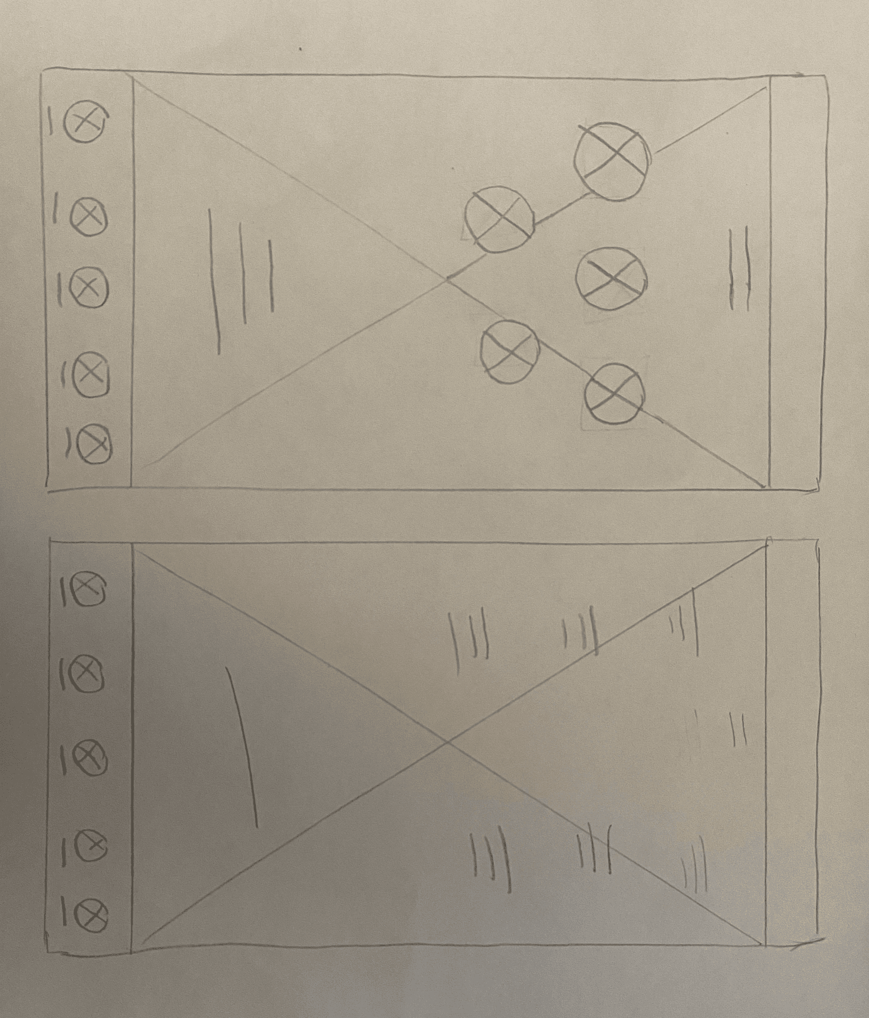

Mobile
Mobile screen variations
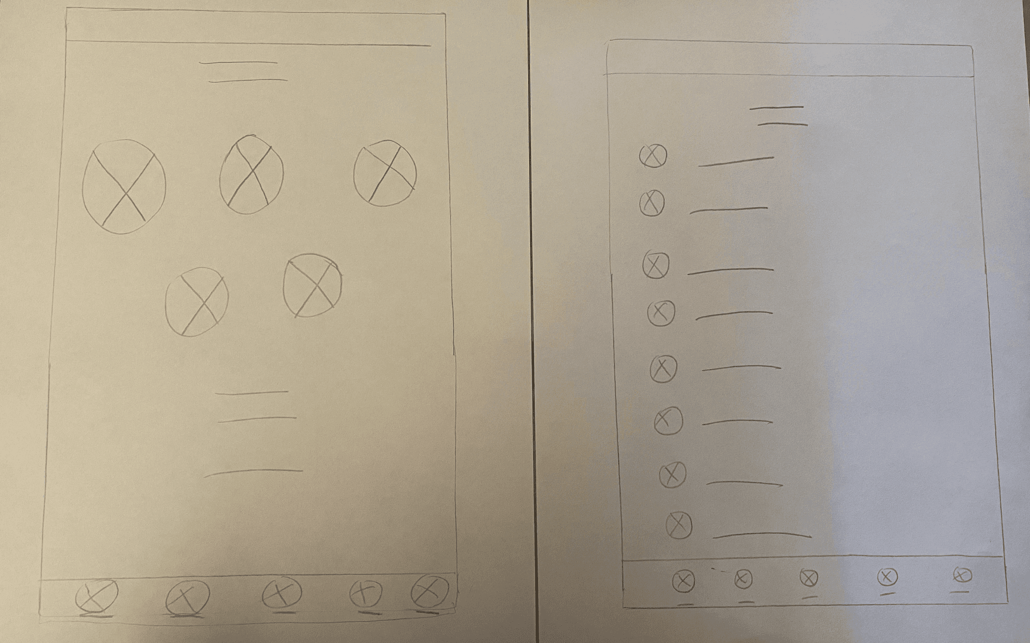

Tablet
Tablet screen variations
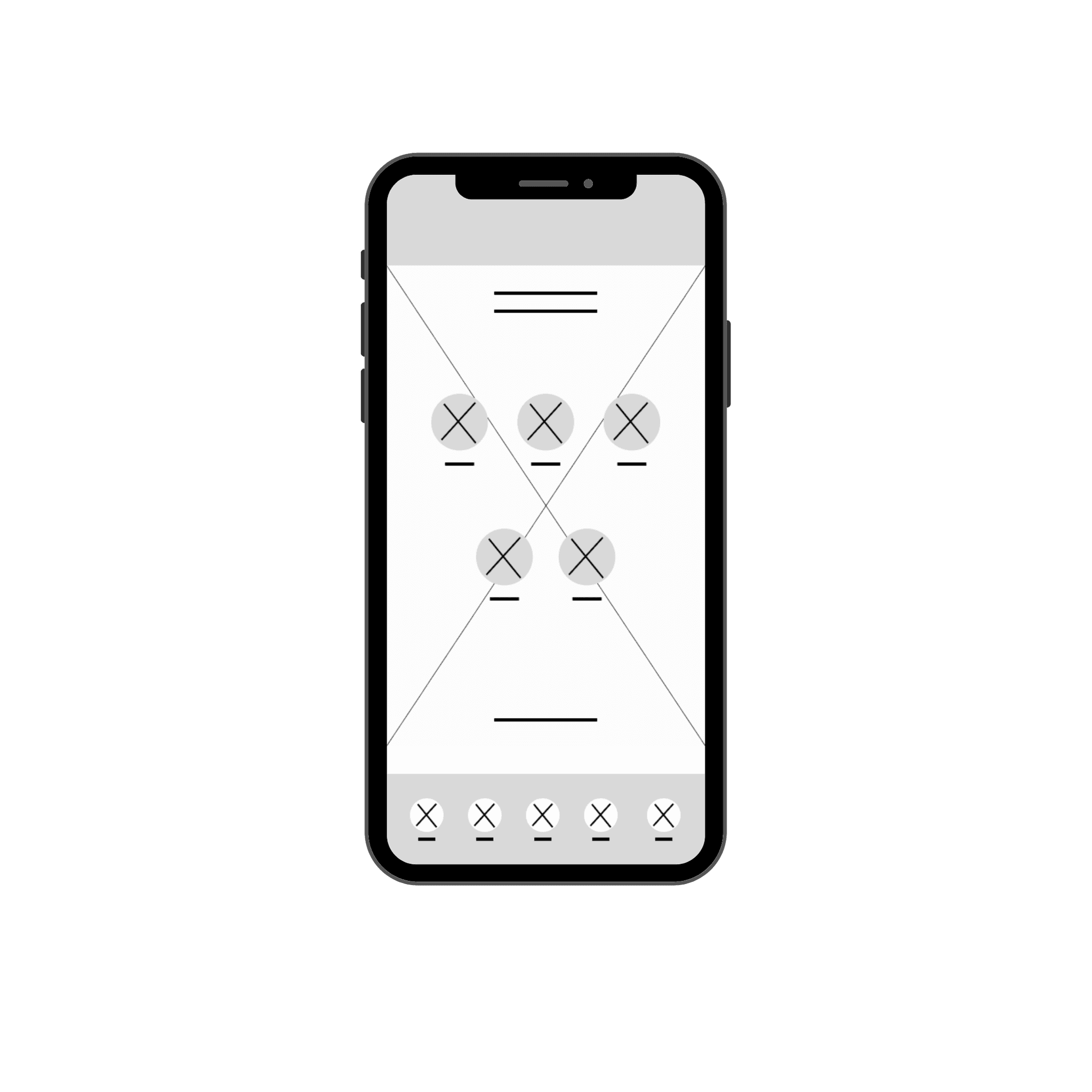

Wireframe
Home page
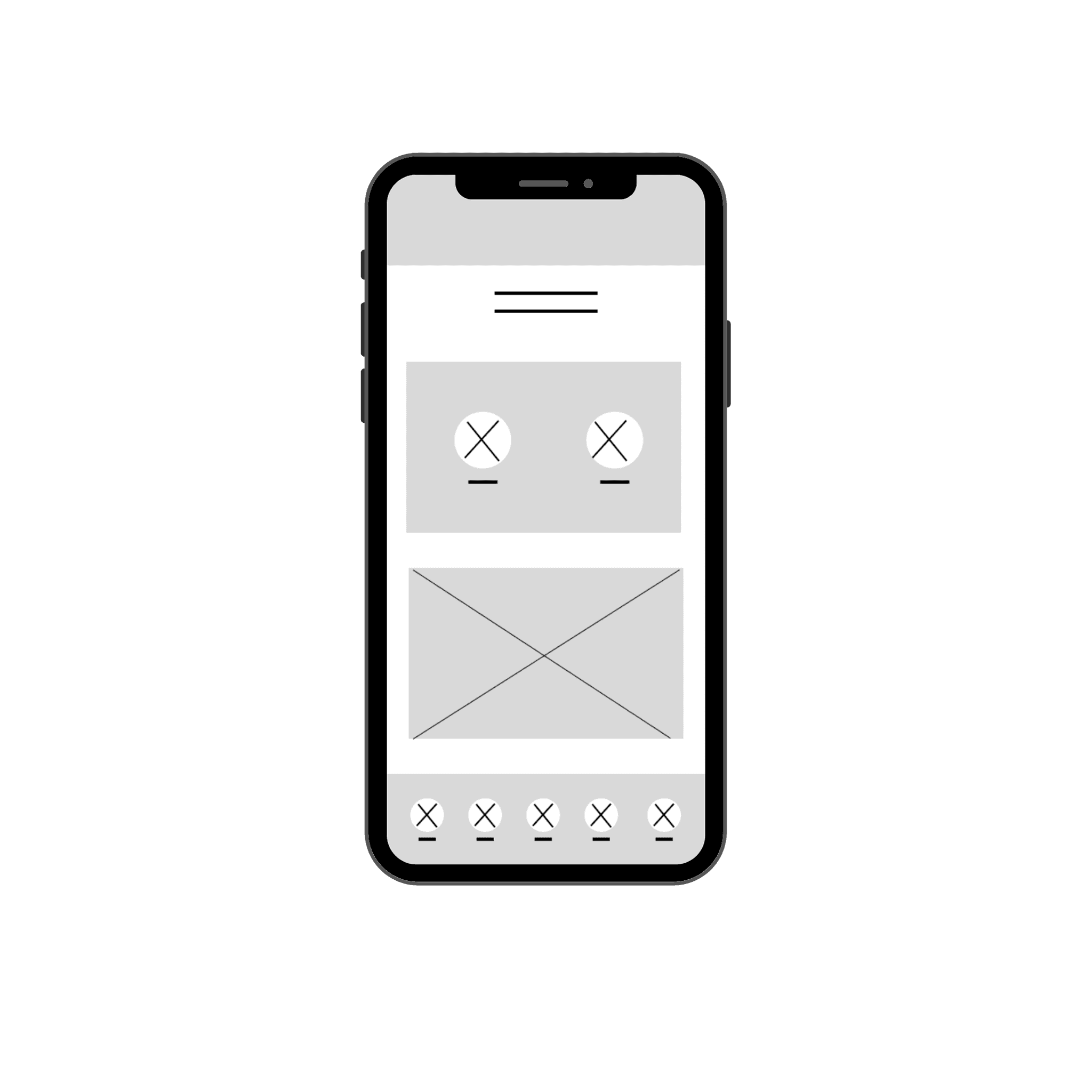

Wireframe
Upcoming matches


Starting
the design
Mobile
Mobile paper wireframes
Mobile screen variations


Tablet
Tablet screen variations

Tablet
Tablet paper wireframes


Digital Wireframes
Mobile homepage


Digital Wireframes
Upcoming matches
Starting the design


High Fidelity Designs
Mobile homepage
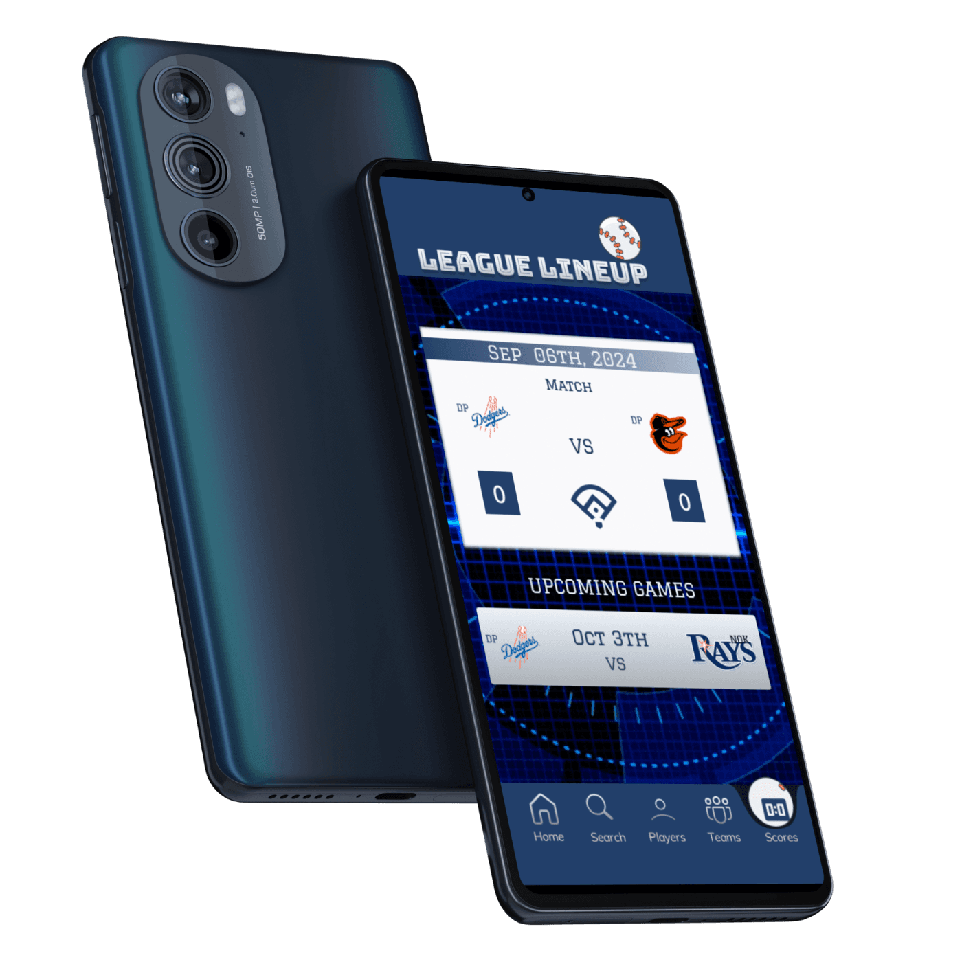


High Fidelity Designs
Upcoming Matches
Findings from usability studies
Findings from usability studies
I conducted 2 usability studies. Key findings included challenges with navigation, technical issues impacting user experience. Inconsistencies in design elements, and missing essential features. These insights highlighted areas for improvement in usability, functionality, and design coherence.
Feedback highlighted inconsistencies in design elements and visual hierarchy throughout the app, leading to confusion and a lack of coherence in the user interface.
Users consistently struggled with navigating the app, particularly in finding specific features or content.
Technical Issues: Users encountered frequent technical issues, such as slow loading times, unresponsive features.
Users found certain instructions or prompts within the app to be unclear or confusing, leading to hesitation and uncertainty in completing tasks.
User expressed lack of color kept him disengaged in the initial low fidelity prototype usability test.


Before


After
Better control panel with directions on how to use app.


Before
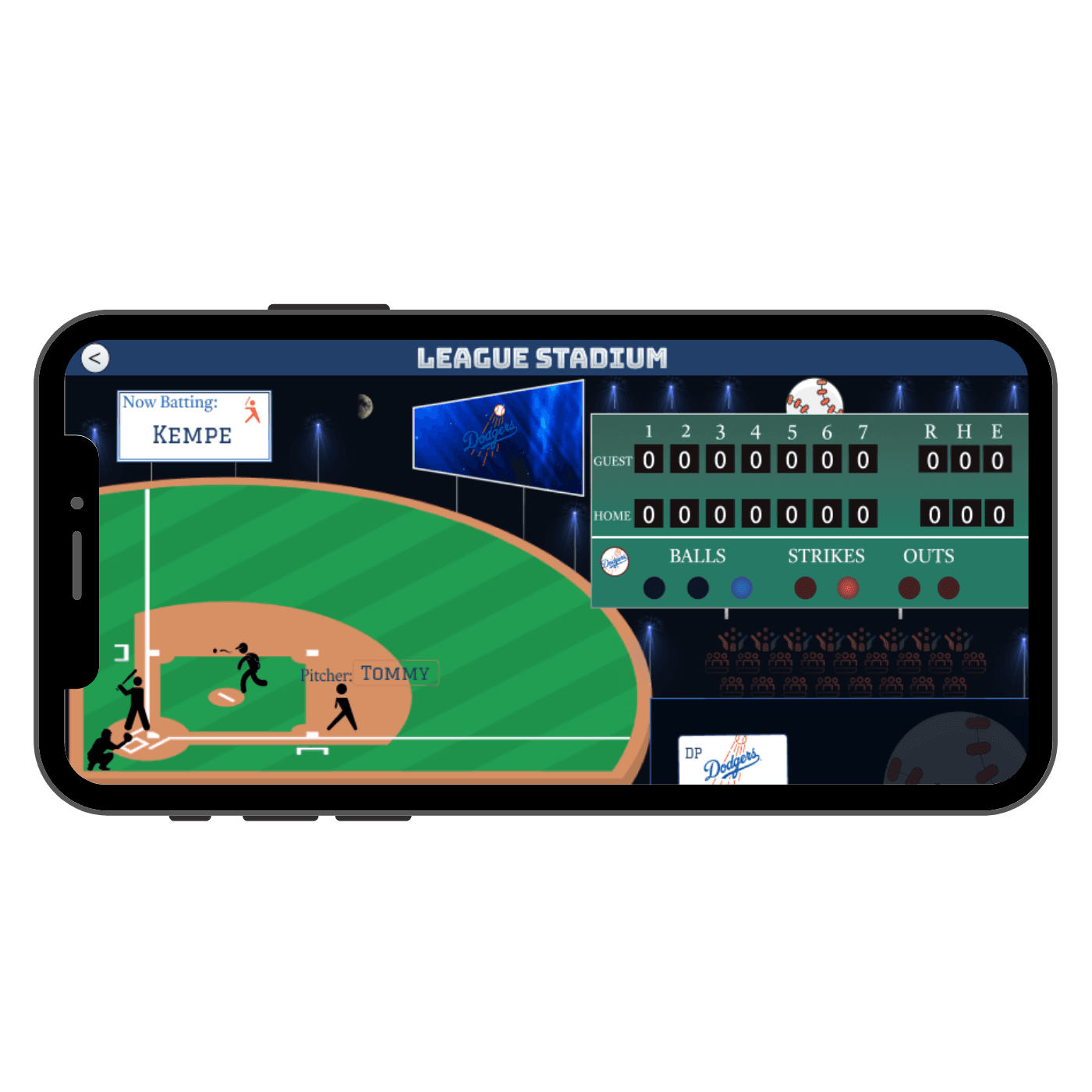

After
7 innings instead of 10, games don’t go over 6 innings or 1.5 hours.
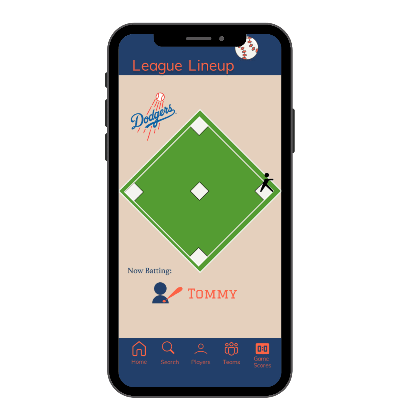

Before
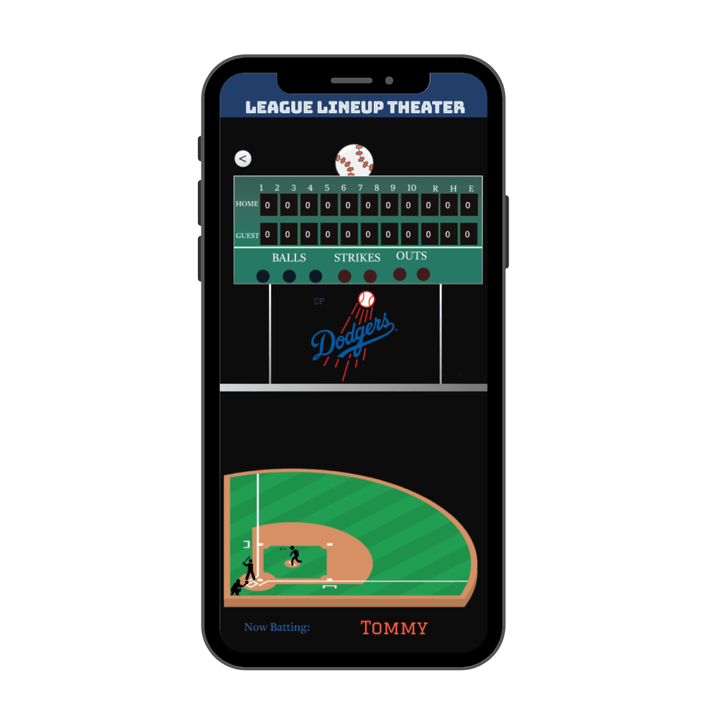

After
Score and game displayed simultaneously; Web accessibility standards met.
Iterations after user feedback
Accessibility Considerations
Keyboard Navigation: The interface is designed to be fully navigable using keyboard shortcuts and tabbing, allowing users who cannot use a mouse to access all features and functionalities easily, promoting inclusivity for users with motor disabilities.
Screen Reader Compatibility: All interface elements are labeled with descriptive text and include proper alt text for images to ensure compatibility with screen readers, facilitating accessibility for users with visual impairments.
Color Contrast: High color contrast ratios are used throughout the design to improve readability and ensure that text and interactive elements are distinguishable for users with low vision or color blindness, enhancing accessibility for all users.
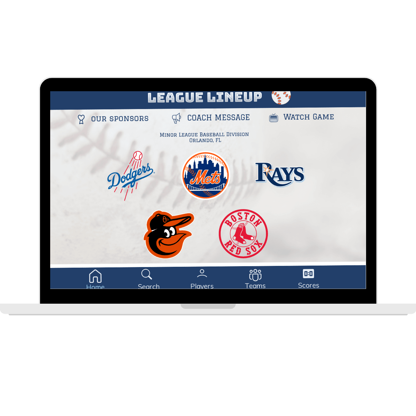

Desktop
Homepage
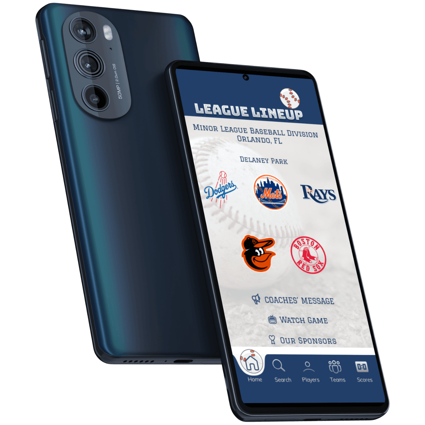

Mobile
Homepage
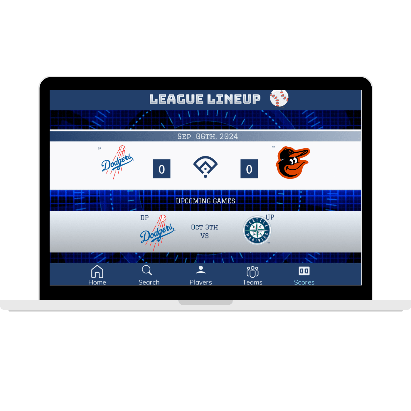

Desktop
Upcoming matches
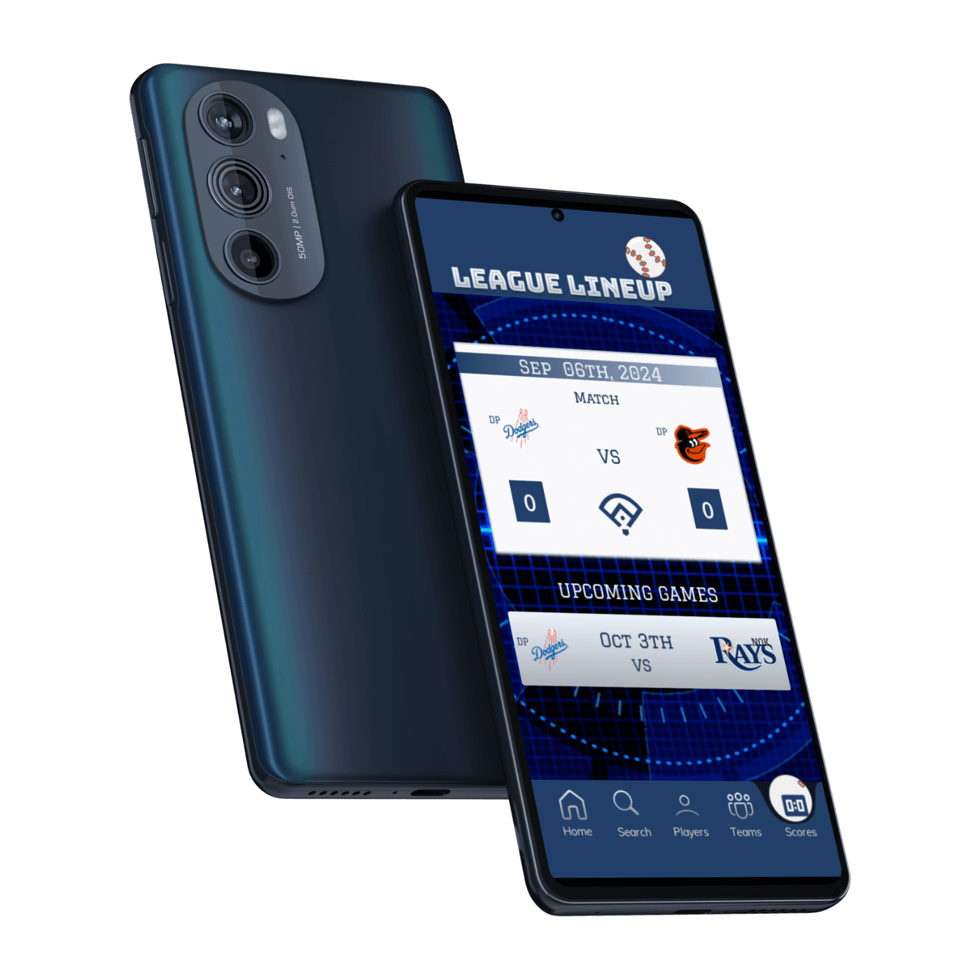

Mobile
Upcoming matches
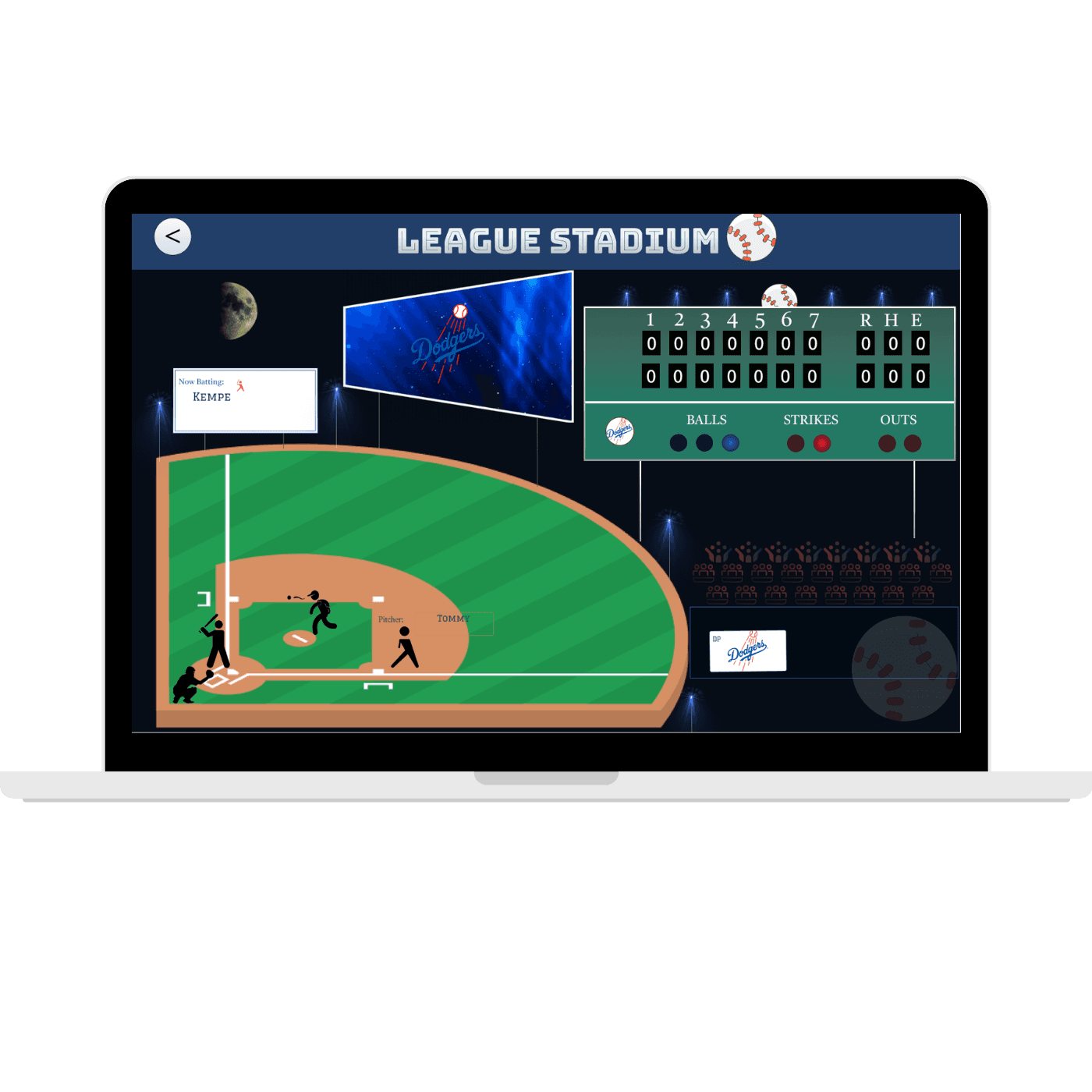

Desktop
Game


Mobile
Game
next steps
The next steps for this project would involve implementing the feedback and insights gathered from user testing to iterate on the designs further. This includes refining navigation elements, addressing technical issues, and incorporating missing features identified by users.
Conducting additional rounds of usability testing with a larger and more diverse user group would help validate design decisions and ensure the continued improvement of the app's usability and accessibility. Regular user feedback loops and ongoing iteration are essential to creating a successful and user-centric product.
Regular user feedback loops and ongoing iteration are essential to creating a successful and user-centric product.
UI Design


STYLE GUIDE


COLOR GUIDE
LIGHT
ABCDEFGHIJKLMNOPQRSTUVWXYX
REGULER
ABCDEFGHIJKLMNOPQRSTUVWXYX
MEDIUM
ABCDEFGHIJKLMNOPQRSTUVWXYX
SEMI BOLD
ABCDEFGHIJKLMNOPQRSTUVWXYX
BOLD
ABCDEFGHIJKLMNOPQRSTUVWXYX
LIGHT
ABCDEFGHIJKLMNOPQRSTUVWXYX
REGULER
ABCDEFGHIJKLMNOPQRSTUVWXYX
MEDIUM
ABCDEFGHIJKLMNOPQRSTUVWXYX
SEMI BOLD
ABCDEFGHIJKLMNOPQRSTUVWXYX
BOLD
ABCDEFGHIJKLMNOPQRSTUVWXYX



Typography
Graduate
Hepta Slab
LIGHT
ABCDEFGHIJKLMNOPQRSTUVWXYX
REGULER
ABCDEFGHIJKLMNOPQRSTUVWXYX
MEDIUM
ABCDEFGHIJKLMNOPQRSTUVWXYX
SEMI BOLD
ABCDEFGHIJKLMNOPQRSTUVWXYX
BOLD
ABCDEFGHIJKLMNOPQRSTUVWXYX
ICONOGRAPHY


Bungee Inline
home
Thanks for watching
www.linkedin.com/
https://www.behance.net/marciaeffron
marciaeffron@gmail.com
Iterations after user feedback


Before


After
Score and game displayed simultaneously; Web accessibility standards met.


Before


After
Better control panel with directions on how to use app.


Before


After
7 innings instead of 10, games don’t go over 6 innings or 1.5 hours.
Accessibility Considerations
Accessibility Considerations
Keyboard Navigation: The interface is designed to be fully navigable using keyboard shortcuts and tabbing, allowing users who cannot use a mouse to access all features and functionalities easily, promoting inclusivity for users with motor disabilities.
Screen Reader Compatibility: All interface elements are labeled with descriptive text and include proper alt text for images to ensure compatibility with screen readers, facilitating accessibility for users with visual impairments.
Color Contrast: High color contrast ratios are used throughout the design to improve readability and ensure that text and interactive elements are distinguishable for users with low vision or color blindness, enhancing accessibility for all users.


Desktop


Mobile


Desktop


Mobile

Desktop

Mobile
Next steps
Next steps
The next steps for this project would involve implementing the feedback and insights gathered from user testing to iterate on the designs further. This includes refining navigation elements, addressing technical issues, and incorporating missing features identified by users.
Conducting additional rounds of usability testing with a larger and more diverse user group would help validate design decisions and ensure the continued improvement of the app's usability and accessibility. Regular user feedback loops and ongoing iteration are essential to creating a successful and user-centric product.
Regular user feedback loops and ongoing iteration are essential to creating a successful and user-centric product.
UI Design

STYLE GUIDE
COLOR GUIDE
LIGHT
ABCDEFGHIJKLMNOPQRSTUVWXYX
REGULER
ABCDEFGHIJKLMNOPQRSTUVWXYX
MEDIUM
ABCDEFGHIJKLMNOPQRSTUVWXYX
SEMI BOLD
ABCDEFGHIJKLMNOPQRSTUVWXYX
BOLD
ABCDEFGHIJKLMNOPQRSTUVWXYX
LIGHT
ABCDEFGHIJKLMNOPQRSTUVWXYX
REGULER
ABCDEFGHIJKLMNOPQRSTUVWXYX
MEDIUM
ABCDEFGHIJKLMNOPQRSTUVWXYX
SEMI BOLD
ABCDEFGHIJKLMNOPQRSTUVWXYX
BOLD
ABCDEFGHIJKLMNOPQRSTUVWXYX


Typography
Graduate
LIGHT
ABCDEFGHIJKLMNOPQRSTUVWXYX
REGULER
ABCDEFGHIJKLMNOPQRSTUVWXYX
MEDIUM
ABCDEFGHIJKLMNOPQRSTUVWXYX
SEMI BOLD
ABCDEFGHIJKLMNOPQRSTUVWXYX
BOLD
ABCDEFGHIJKLMNOPQRSTUVWXYX
ICONOGRAPHY

Bungee Inline

UI Design

STYLE GUIDE

COLOR GUIDE
LIGHT
ABCDEFGHIJKLMNOPQRSTUVWXYX
REGULER
ABCDEFGHIJKLMNOPQRSTUVWXYX
MEDIUM
ABCDEFGHIJKLMNOPQRSTUVWXYX
SEMI BOLD
ABCDEFGHIJKLMNOPQRSTUVWXYX
BOLD
ABCDEFGHIJKLMNOPQRSTUVWXYX
LIGHT
ABCDEFGHIJKLMNOPQRSTUVWXYX
REGULER
ABCDEFGHIJKLMNOPQRSTUVWXYX
MEDIUM
ABCDEFGHIJKLMNOPQRSTUVWXYX
SEMI BOLD
ABCDEFGHIJKLMNOPQRSTUVWXYX
BOLD
ABCDEFGHIJKLMNOPQRSTUVWXYX
LIGHT
ABCDEFGHIJKLMNOPQRSTUVWXYX
REGULER
ABCDEFGHIJKLMNOPQRSTUVWXYX
MEDIUM
ABCDEFGHIJKLMNOPQRSTUVWXYX
SEMI BOLD
ABCDEFGHIJKLMNOPQRSTUVWXYX
BOLD
ABCDEFGHIJKLMNOPQRSTUVWXYX
Hepta Slab


Bungee Inline
Typography
Graduate
home
Thanks for watching
Thanks for watching


