Skate World
PLATFORM
Designed by Marcia Effron
Role:
UI/UX CASE STUDY





UI/UX Designer
Skate World
"This project requires a highly skilled UX and UI Designer to tackle significant challenges with creativity, an open mindset, and advanced interactive UI design techniques."
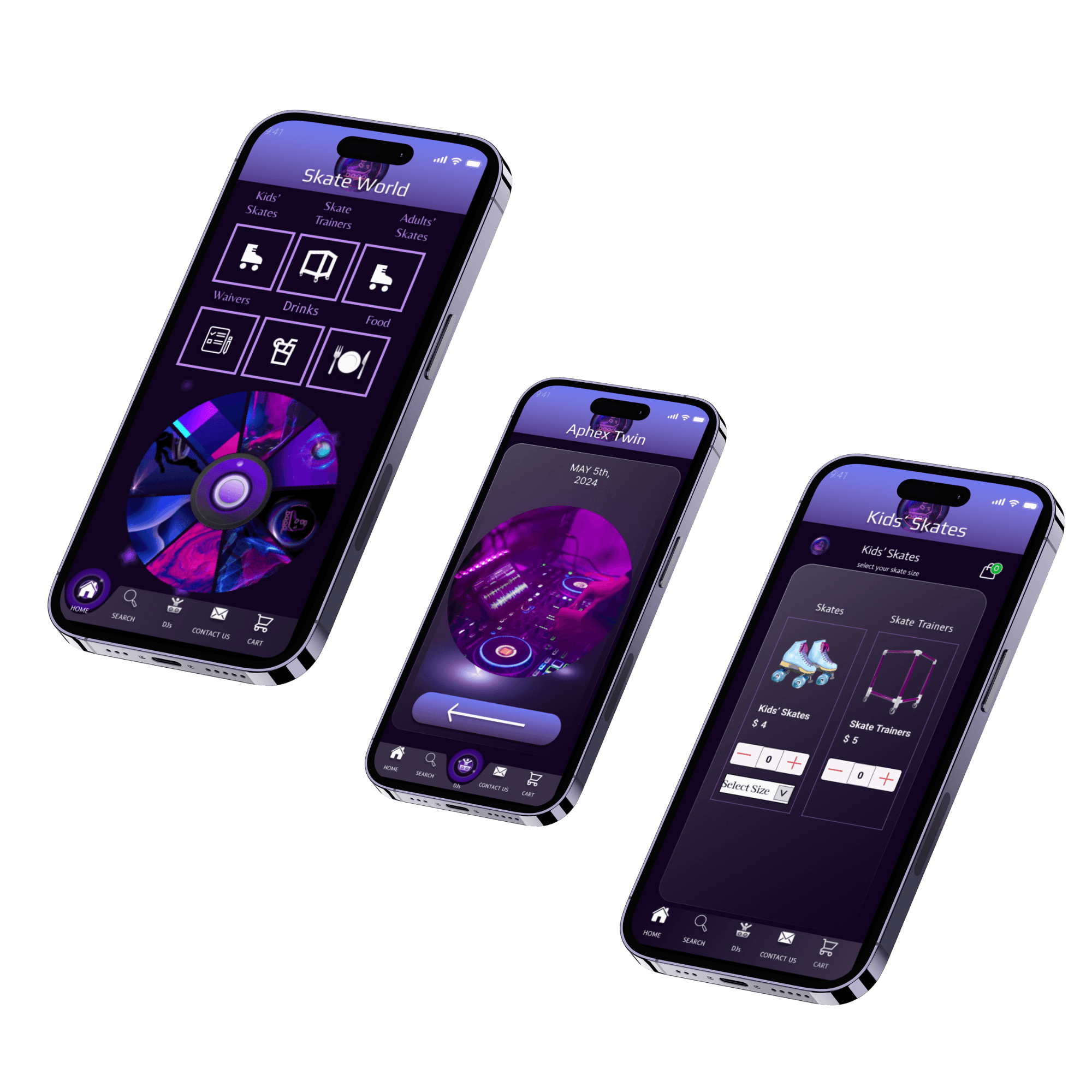
Skate World is the ultimate app for roller skate and roller blade enthusiasts, providing a one-stop platform for all things roller skating. Whether you're a beginner looking to learn the ropes or a seasoned pro seeking new challenges, Skate World has you covered. Project duration: 5/05/23-12/05/23
Overview
Platform
iOS 14
Desktop
The Story
The lack of existing technology in the Roller Skate area, makes the author interested in designing applications that make it easier for users to rent roller-skates, skate trainers, food & drink items online.
Still using the offline method.
Young & inexperienced users unable
to rent a skate trainer prior to
experience.
User is subject to arrive and not have
their size available.
No social media presence.
User has to bring cash instead of
being able to use apple pay.
Users cannot place orders directly.
Seller has difficulty recording sales
and goods.
PROBLEM
There are significant navigational challenges and usability issues within the current platform for skaters of all levels, leading to a fragmented and unintuitive user experience. Additionally, the social features are underdeveloped, which limits engagement and connection within the skating community. To resolve these issues, the platform needs to be redesigned to provide a seamless and intuitive experience and to enhance social interactions and engagement among users.
VS
SOLUTION
Creation of online ordering feature.
Skate sizes that include 3 toddler to
13 adult.
User can see the progress of the
transaction clearly.
Users can have a food menu geared
for party hosting.
Goods that are categorized, so that
users are not confused.
Social Media Pages such as Instagram, X,
Meta & Tik Tok
Adding payment options makes users
more confident
when making purchases.
my role
UX Designer
To craft seamless and intuitive digital experiences that resonate with users. I start by conducting thorough user research to understand needs and pain points, followed by creating wireframes and prototypes to visualize solutions. My process involves iterative testing and feedback to refine designs, ensuring they are both functional and delightful. By balancing user needs with business goals, I aim to deliver impactful and user-centered designs that enhance overall satisfaction and engagement.
Pain Points
Navigational Complexity:
Users consistently struggled with navigating the app, particularly in finding specific features or content.
Functionality Issue:
A functionality issue which users encountered in the skate app is the inability to delete items from the cart, particularly when attempting to remove a cupcake order.
Technical Issues:
Users encounter frequent app crashes, slow loading times, or unresponsive features, disrupting their browsing experience.
Clarity and Comunication
Users found certain instructions or prompts within the app to be unclear or confusing, leading to hesitation and uncertainty in completing tasks.
Lack of personalization and
flexibility:
Users express frustration with the lack of customization options, such as personalizing training programs or adjusting settings according to skill levels.
User Interface pain point:
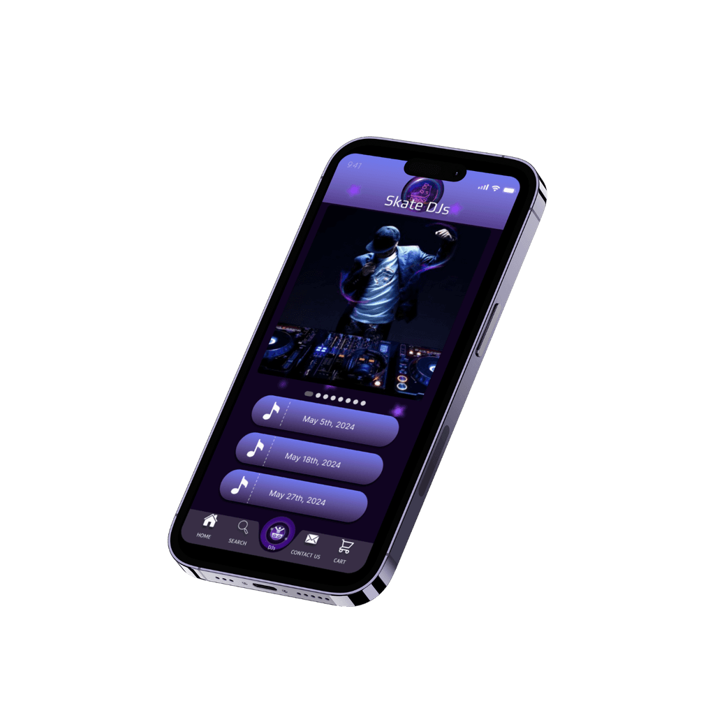
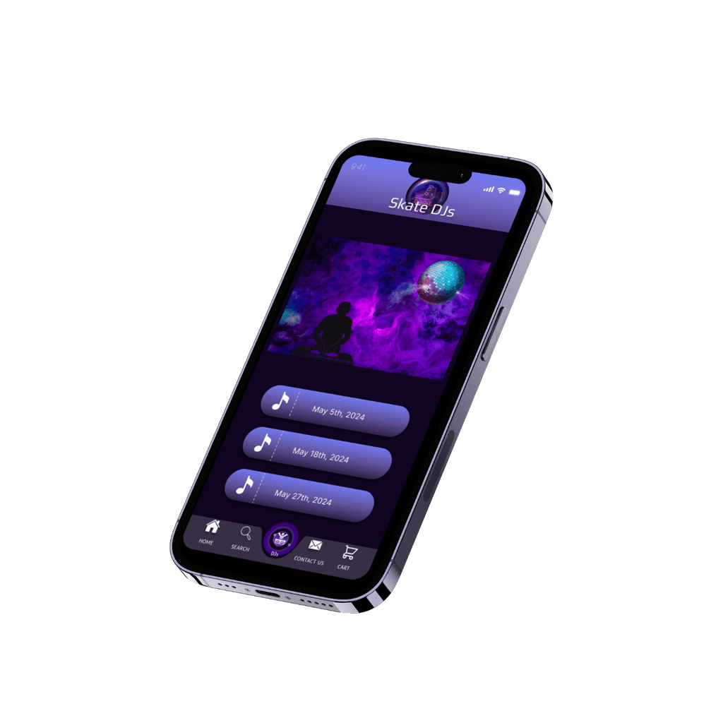
Too many buttons on the Dj homepage screen
visual clutter
Preparation


DESIGN PROCESS
Ideate
Turn idea from concept and brainstorm to MVP
Design
Sketch out the product to align the user needs
Develop
Convert the designs into a live application
Launch
Launching the application to the market
Design Strategy
Create a skate app with intuitive navigation, comprehensive skate spot details, food & drink menu, and vibrant community & engagement features.
Intention
To provide a seamless platform where skaters of all levels can connect, share their passion, discover new spots, and enhance their skills. Our commitment to intuitive design and engaging features ensures that Skate World not only supports the skating community but also celebrates its culture and creativity.
General task
Online food menu
Waiver page
Skate trainer
Kids’ skates
Social media pages
Multiple forms of payment
Target User
a large Number of people, age : 13+ Years
People who use Mobile platforms
Tech Constraint
Platform Compatibility
Performance Optimization
Testing and Bug Fixing
Success Factor
Total revenue generated from food orders via the app
Ratings and comments on the effectiveness of the skate trainer.
Amount of traffic driven to the app from social media platforms
Number of transactions processed through each payment method.


starting the design
paper wireframes
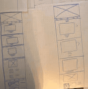

paper wireframes
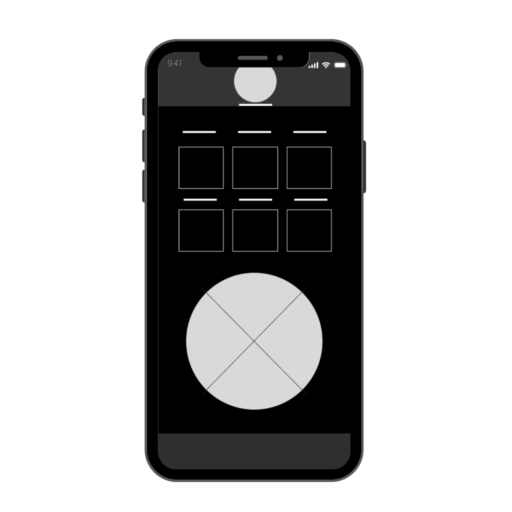

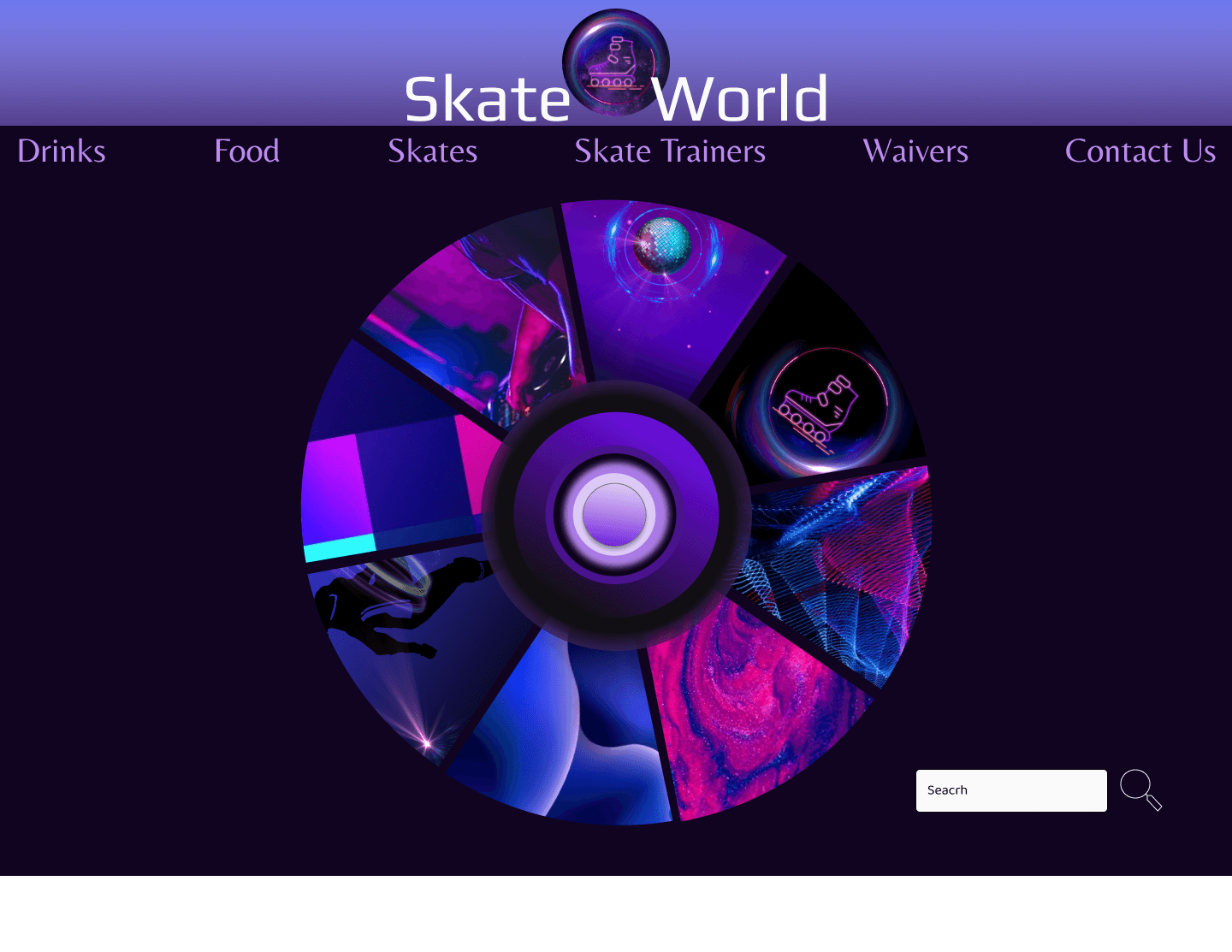
Low-fidelity prototype
Landing page
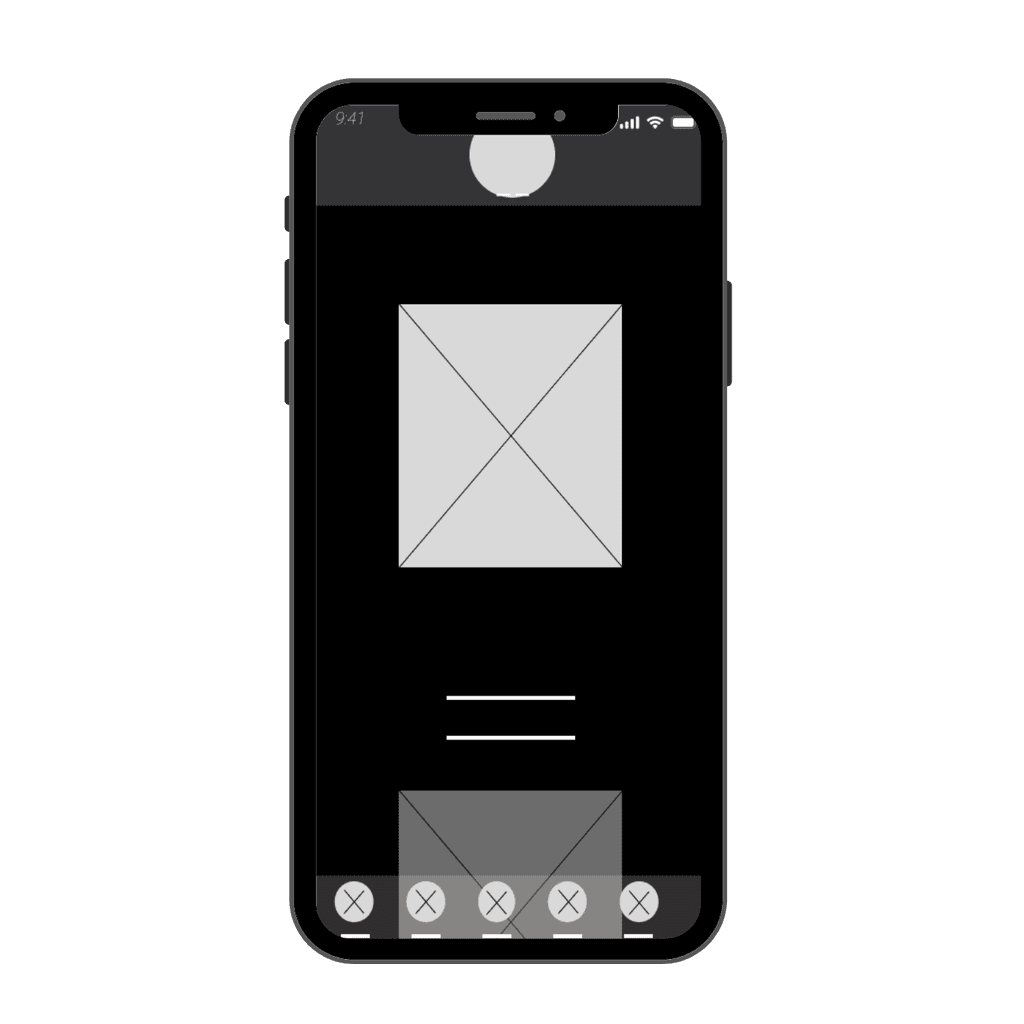

Low-fidelity prototype
Dj page
Summary of User research
During the app creation process, extensive research was conducted to gain a deep understanding of user needs, preferences, and behaviors. This research encompassed various methods such as user interviews, surveys, competitor analysis, and usability testing. Insights gathered from the research phase informed the design and development process, ensuring that the final app delivers a user-centered experience tailored to the needs of its target audience.
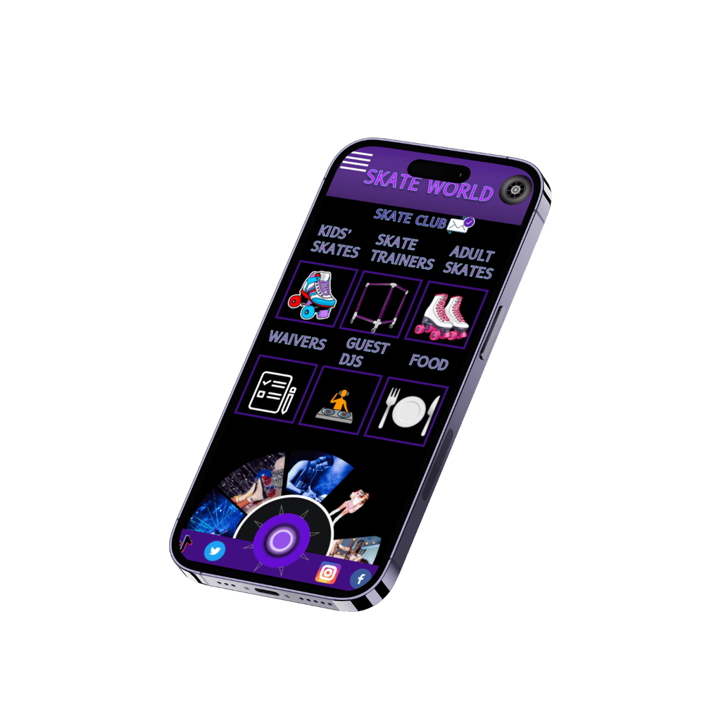

High Fidelity Prototype
iterations based on user feedback
High Fidelity Prototype
after
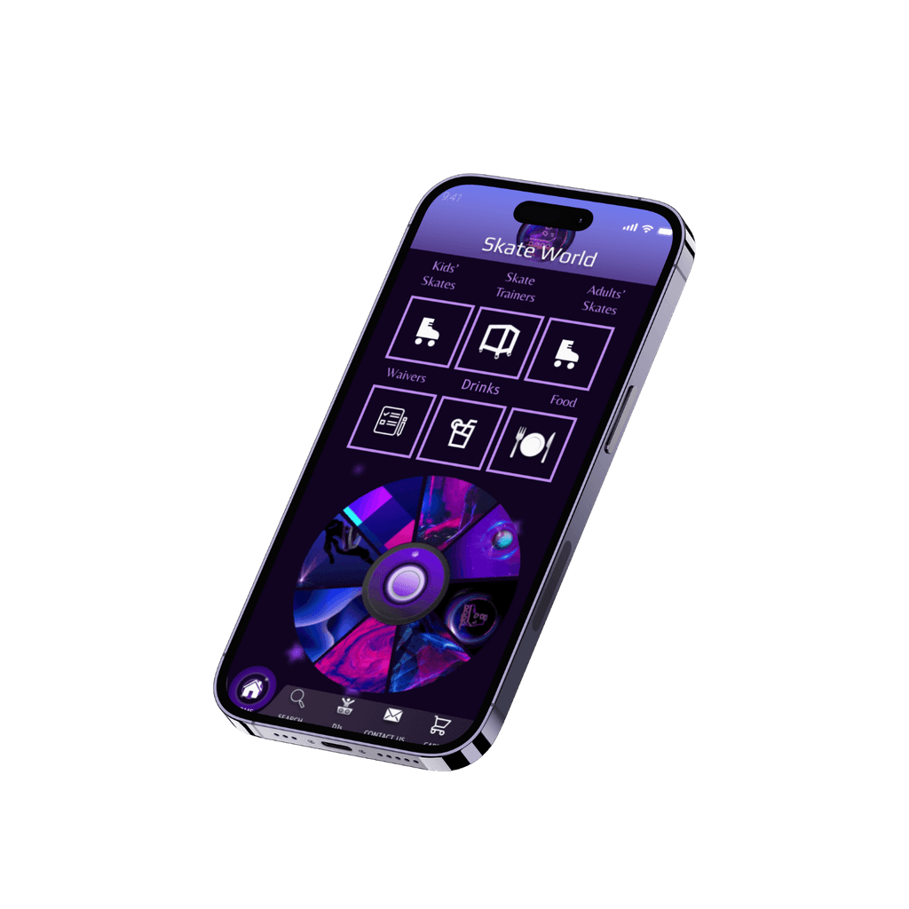


Before

After
UI/Design
STYLE GUIDE


COLOR GUIDE


Typography
Play
LIGHT
ABCDEFGHIJKLMNOPQRSTUVWXYX
REGULER
ABCDEFGHIJKLMNOPQRSTUVWXYX
MEDIUM
ABCDEFGHIJKLMNOPQRSTUVWXYX
SEMI BOLD
ABCDEFGHIJKLMNOPQRSTUVWXYX
BOLD
ABCDEFGHIJKLMNOPQRSTUVWXYX
Belleza
LIGHT
ABCDEFGHIJKLMNOPQRSTUVWXYX
ABCDEFGHIJKLMNOPQRSTUVWXYX
ABCDEFGHIJKLMNOPQRSTUVWXYX
SEMI BOLD
ABCDEFGHIJKLMNOPQRSTUVWXYX
BOLD
ABCDEFGHIJKLMNOPQRSTUVWXYX
Inter
SEMI BOLD
ABCDEFGHIJKLMNOPQRSTUVWXYX
BOLD
ABCDEFGHIJKLMNOPQRSTUVWXYX
LIGHT
ABCDEFGHIJKLMNOPQRSTUVWXYX
REGULER
ABCDEFGHIJKLMNOPQRSTUVWXYX
MEDIUM
ABCDEFGHIJKLMNOPQRSTUVWXYX


ICONOGRAPHY
Accessibility
Considerations
The interface is designed to be fully navigable using keyboard shortcuts and tabbing, allowing users who cannot use a mouse to access all features and functionalities easily, promoting inclusivity for users with motor disabilities.
All interface elements are labeled with descriptive text and include proper alt text for images to ensure compatibility with screen readers, facilitating accessibility for users with visual impairments.
High color contrast ratios are used throughout the design to improve readability and ensure that text and interactive elements are distinguishable for users with low vision or color blindness, enhancing accessibility for all users.
Next Steps
Conducting additional rounds of usability testing with a larger and more diverse user group would help validate design decisions and ensure the continued improvement of the app's usability and accessibility. Regular user feedback loops and ongoing iteration are essential to creating a successful and user-centric product.
UI Design
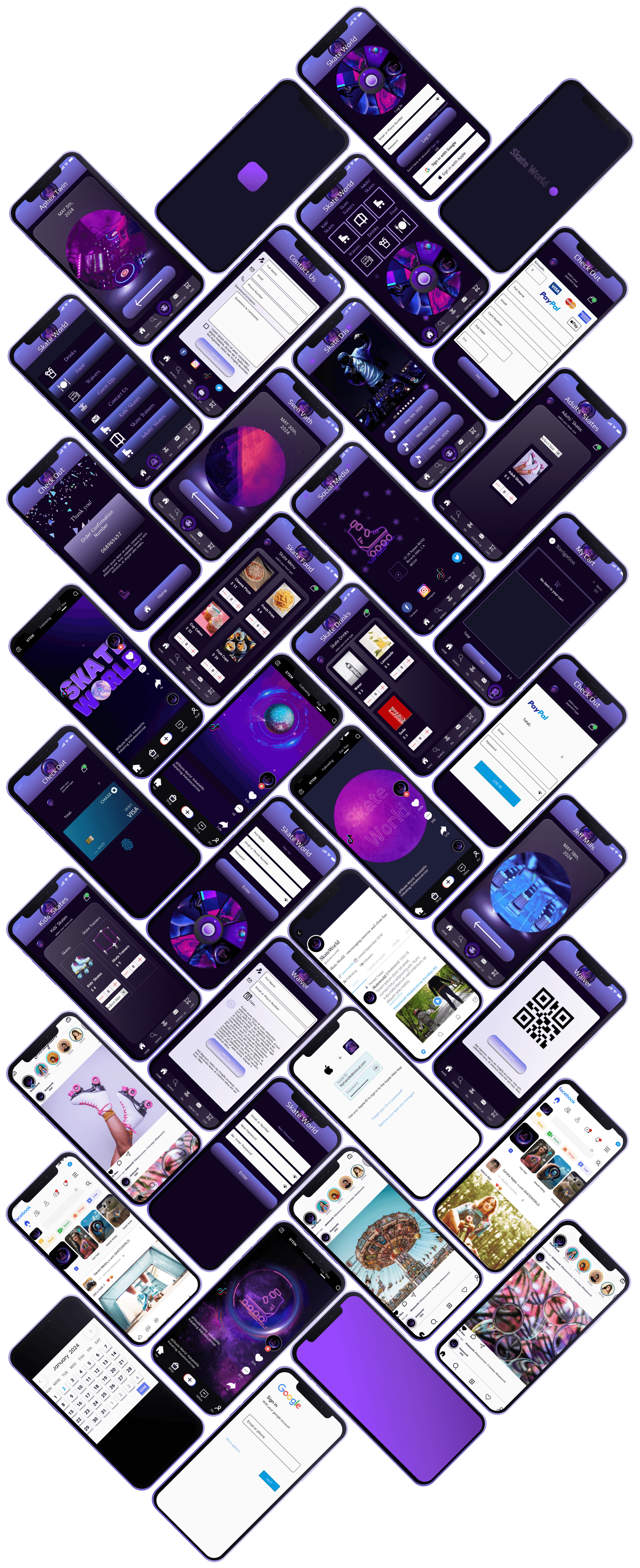
Centering on user needs and goals, streamlining navigation for ease, embodying brand identity, and fostering engagement through interactive features.
Home


Skate World
Skate World
PLATFORM
PLATFORM
Designed by Marcia Effron
Designed by Marcia Effron
Role:
UI/UX CASE STUDY
UI/UX Designer


Skate World
Skate World
"This project requires a highly skilled UX and UI Designer to tackle significant challenges with creativity, an open mindset, and advanced interactive UI design techniques."
Overview
Platform
Skate World is the ultimate app for roller skate and roller blade enthusiasts, providing a one-stop platform for all things roller skating. Whether you're a beginner looking to learn the ropes or a seasoned pro seeking new challenges, Skate World has you covered. Project duration: 5/05/23-12/05/23
Overview
Platform
Skate World is the ultimate app for roller skate and roller blade enthusiasts, providing a one-stop platform for all things roller skating. Whether you're a beginner looking to learn the ropes or a seasoned pro seeking new challenges, Skate World has you covered. Project duration: 5/05/23-12/05/23
The Story
The lack of existing technology in the Roller Skate area, makes the author interested in designing applications that make it easier for users to rent roller-skates, skate trainers, food & drink items online.
iOS
Desktop
Desktop
Creation of online ordering feature.
Skate sizes that include 3 toddler to 13
adult.
User can see the progress of the
transaction clearly.
Users can have a food menu geared for
party hosting.
Goods that are categorized, so that users
are not confused.
Social media such as Instagram, X,
Meta & Tik Tok
Adding payment options makes users
more confident when making purchases.
To create a user centric skate app that provides skaters with a seamless and engaging platform to connect, improve their skills, and explore the vibrant world of rollerskating.
SOLUTION
There are significant navigational challenges and usability issues within the current platform for skaters of all levels, leading to a fragmented and unintuitive user experience. Additionally, the social features are underdeveloped, which limits engagement and connection within the skating community. To resolve these issues, the platform needs to be redesigned to provide a seamless and intuitive experience and to enhance social interactions and engagement among users.
Still using the offline method.
Inexperienced users unable to rent a skate trainer
prior to experience.
User is subject to arrive and not have their size
available.
No social media presence.
User has to bring cash instead of being able to use
apple pay.
Users cannot place orders directly.
Seller has difficulty recording sales and goods.
VS
PROBLEM
Creation of online ordering feature.
Skate sizes that include 3 toddler to 13 adult.
User can see the progress of the transaction clearly.
Users can have a food menu geared for party hosting.
Goods that are categorized, so that users are not confused.
Social Media Pages such as Instagram, X, Meta & Tik Tok
Adding payment options makes users more confident when
making purchases.
To create a user centric skate app that provides skaters with a seamless and engaging platform to connect, improve their skills, and explore the vibrant world of rollerskating.
SOLUTION
PROBLEM
my role
my role
UX Designer
To craft seamless and intuitive digital experiences that resonate with users. I start by conducting thorough user research to understand needs and pain points, followed by creating wireframes and prototypes to visualize solutions. My process involves iterative testing and feedback to refine designs, ensuring they are both functional and delightful. By balancing user needs with business goals, I aim to deliver impactful and user-centered designs that enhance overall satisfaction and engagement.
Pain Points
Navigational Complexity:
Navigational
Complexity:
Users consistently struggled with navigating the app, particularly in finding specific features or content.
Functionality Issue:
Functionality
Issue:
A functionality issue which users encountered in the skate app is the inability to delete items from the cart, particularly when attempting to remove a cupcake order.
Technical Issues:
Technical
Issues:
Users encounter frequent app crashes, slow loading times, or unresponsive features, disrupting their browsing experience.
Clarity and Comunication
Clarity and
Communication
Users found certain instructions or prompts within the app to be unclear or confusing, leading to hesitation and uncertainty in completing tasks.
Lack of personalization and
flexibility:
Lack of
personalization
and
flexibility:
Users express frustration with the lack of customization options, such as personalizing training programs or adjusting settings according to skill levels.
User Interface pain point:
User
Interface pain
point:
Too many buttons on the Dj homepage screen
visual clutter
DESIGN PROCESS
Preparation

Ideate
Turn idea from concept and brainstorm to MVP
Design
Sketch out the product to align the user needs
Develop
Convert the designs into a live application
Launch
Launching the application to the market
Target User
a large Number of people, age : 13+ Years
People who use Mobile platforms
Intention
To provide a seamless platform where skaters of all levels can connect, share their passion, discover new spots, and enhance their skills. My commitment to intuitive design and engaging features ensures that Skate World not only supports the skating community but also celebrates its culture and creativity.
Tech Constraint
Platform Compatibility
Performance Optimization
Testing and Bug Fixing
Design Strategy
Design Strategy
Create a skating app with intuitive navigation, comprehensive skate spot details, food & drink menu, and vibrant community & engagement features.
Create a skating app with intuitive navigation, comprehensive skate spot details, food & drink menu, and vibrant community & engagement features.
Success Factor
Total revenue generated from food orders via the app
Ratings and comments on the effectiveness of the skate trainer.
Amount of traffic driven to the app from social media platforms
Number of transactions processed through each payment method.
General task
Online food menu
Waiver page
Skate trainer
Kids’ skates
Social media pages
Multiple forms of payment

starting the design
starting the
design
paper wireframes-landing page

paper wireframes-screen size variations


Low-fidelity prototype
Landing page
Low-fidelity prototype
Low-fidelity prototype
Dj page


Summary of User research
Summary of User research
During the app creation process, extensive research was conducted to gain a deep understanding of user needs, preferences, and behaviors. This research encompassed various methods such as user interviews, surveys, competitor analysis, and usability testing. Insights gathered from the research phase informed the design and development process, ensuring that the final app delivers a user-centered experience tailored to the needs of its target audience.


High Fidelity Prototype
iterations based on user feedback
High Fidelity Prototype
after


UI Design

STYLE GUIDE
Typography

Play
COLOR GUIDE
LIGHT
ABCDEFGHIJKLMNOPQRSTUVWXYX
REGULER
ABCDEFGHIJKLMNOPQRSTUVWXYX
MEDIUM
ABCDEFGHIJKLMNOPQRSTUVWXYX
SEMI BOLD
ABCDEFGHIJKLMNOPQRSTUVWXYX
BOLD
ABCDEFGHIJKLMNOPQRSTUVWXYX
LIGHT
ABCDEFGHIJKLMNOPQRSTUVWXYX
REGULER
ABCDEFGHIJKLMNOPQRSTUVWXYX
MEDIUM
ABCDEFGHIJKLMNOPQRSTUVWXYX
SEMI BOLD
ABCDEFGHIJKLMNOPQRSTUVWXYX
BOLD
ABCDEFGHIJKLMNOPQRSTUVWXYX
Belleza
Inter
LIGHT
ABCDEFGHIJKLMNOPQRSTUVWXYX
REGULER
ABCDEFGHIJKLMNOPQRSTUVWXYX
MEDIUM
ABCDEFGHIJKLMNOPQRSTUVWXYX
SEMI BOLD
ABCDEFGHIJKLMNOPQRSTUVWXYX
BOLD
ABCDEFGHIJKLMNOPQRSTUVWXYX
ICONOGRAPHY


Before

After
UI Design

STYLE GUIDE
Typography

Play
ICONOGRAPHY

COLOR GUIDE
LIGHT
ABCDEFGHIJKLMNOPQRSTUVWXYX
REGULER
ABCDEFGHIJKLMNOPQRSTUVWXYX
MEDIUM
ABCDEFGHIJKLMNOPQRSTUVWXYX
SEMI BOLD
ABCDEFGHIJKLMNOPQRSTUVWXYX
BOLD
ABCDEFGHIJKLMNOPQRSTUVWXYX
LIGHT
ABCDEFGHIJKLMNOPQRSTUVWXYX
REGULER
ABCDEFGHIJKLMNOPQRSTUVWXYX
MEDIUM
ABCDEFGHIJKLMNOPQRSTUVWXYX
SEMI BOLD
ABCDEFGHIJKLMNOPQRSTUVWXYX
BOLD
ABCDEFGHIJKLMNOPQRSTUVWXYX
LIGHT
ABCDEFGHIJKLMNOPQRSTUVWXYX
REGULER
ABCDEFGHIJKLMNOPQRSTUVWXYX
MEDIUM
ABCDEFGHIJKLMNOPQRSTUVWXYX
SEMI BOLD
ABCDEFGHIJKLMNOPQRSTUVWXYX
BOLD
ABCDEFGHIJKLMNOPQRSTUVWXYX
Inter
Belleza
Accessibility Considerations
The interface is designed to be fully navigable using keyboard shortcuts and tabbing, allowing users who cannot use a mouse to access all features and functionalities easily, promoting inclusivity for users with motor disabilities.
All interface elements are labeled with descriptive text and include proper alt text for images to ensure compatibility with screen readers, facilitating accessibility for users with visual impairments.
High color contrast ratios are used throughout the design to improve readability and ensure that text and interactive elements are distinguishable for users with low vision or color blindness, enhancing accessibility for all users.
Next Steps
Conducting additional rounds of usability testing with a larger and more diverse user group would help validate design decisions and ensure the continued improvement of the app's usability and accessibility. Regular user feedback loops and ongoing iteration are essential to creating a successful and user-centric product.
UI Design
Centering on user needs and goals, streamlining navigation for ease,
embodying brand identity, and fostering engagement
through interactive features.
UI Design
Centering on user needs and goals, streamlining navigation for ease, embodying brand identity, and fostering engagement through interactive features.
